Enhancing dingo: from metabolic models reduction to pathways prediction
Sotiris Touliopoulos
Contributor to Google Summer of Code 2024 with GeomScale
Mentors of this project: Vissarion Fisikopoulos, Apostolos Chalkis and Haris Zafeiropoulos.
Goal of the project
The goal of this project is to enhance dingo by incorporating pre- and post-sampling features to leverage the increased statistical value of flux sampling. For an introduction to dingo and metabolic networks you can refer to this blog.
A preprocessing class, which reduces metabolic networks by removing specific reactions, is integrated into dingo, along with a post-processing function that calculates correlation metrics from pairwise reaction fluxes.
Additionally, functions for clustering and generating graphs from the correlation matrix are implemented to group reactions and predict metabolic pathways.
Separate functions for visualizing matrices, dendrograms, and graphs are also provided.
Preprocess for metabolic models reduction
- Large metabolic models contain numerous reactions and metabolites. When sampling the flux space of such complex models computational intractability may occur [1] [2].
- Model reduction can mitigate this issue by removing specific reactions, thereby decreasing model complexity and computational time. For an estimate of the relationship between number of reactions and computational time you can see figure 1 in dingo’s article [3].
- Reduced models have decreased complexity and can help researchers study basic principles of metabolism too [4].
- Core models may also find applications in biotechnology, where minimal cells with reduced functionality are designed to boost the production of specific chemicals. https://doi.org/10.1016/j.compchemeng.2011.05.006 [1].
The implemented Preprocess class we present here, aims to reduce metabolic models by removing 3 types of reactions:
- Blocked reactions: cannot carry a flux in any condition.
- Zero-flux reactions: cannot carry a flux while maintaining at least 90% of the maximum growth rate.
- Metabolically less-efficient reactions: require a reduction in growth rate if used [5].
After an object is initialized from the PreProcess class, given a cobra model as input, users can call the reduce function on this object to remove the 3 types of reactions. This function sets the lower and upper bounds of these reactions to 0.
Users can also choose to remove an additional set of reactions, by setting the extend parameter of the reduce function to True. These reactions do not affect the value of the objective function when removed. The reduce function returns a reduced dingo model, in order the user can directly apply the classes and functions of the dingo package on this model.
The additional reactions are removed based on a priority order until the growth flux is significantly altered. When this happens, the algorithm stops the reduction. The priority order is formed by calculating the sum of correlations each reaction has with the rest. Reactions with the smaller sum are removed first. The function that calculates the correlation metrics will be analyzed later in this blog.
Now let’s see how to use the Preprocess class and the reduce function:
# load a cobra model
cobra_model = load_json_model("ext_data/e_coli_core.json")

obj = PreProcess(# cobra model as input
                 cobra_model,
                 # tolerance value to identify significant flux changes
                 tol = 1e-6,
                 # boolean variable that define whether to open all exchange reactions to very high flux ranges.
                 open_exchanges = False)

# list of removed reactions, dingo reduced model
removed_reactions, reduced_dingo_model = obj.reduce(extend = False)
For more information on the open_exchanges variable you can refer to the cobrapy package.
The e_coli_core.json model we use represents the core metabolism of the E. coli. You can find the model and related data here.
Reduction with the PreProcess class has been tested with various models from the BiGG database [6]. Figures below show the number of remained reactions, after applying the reduce function:
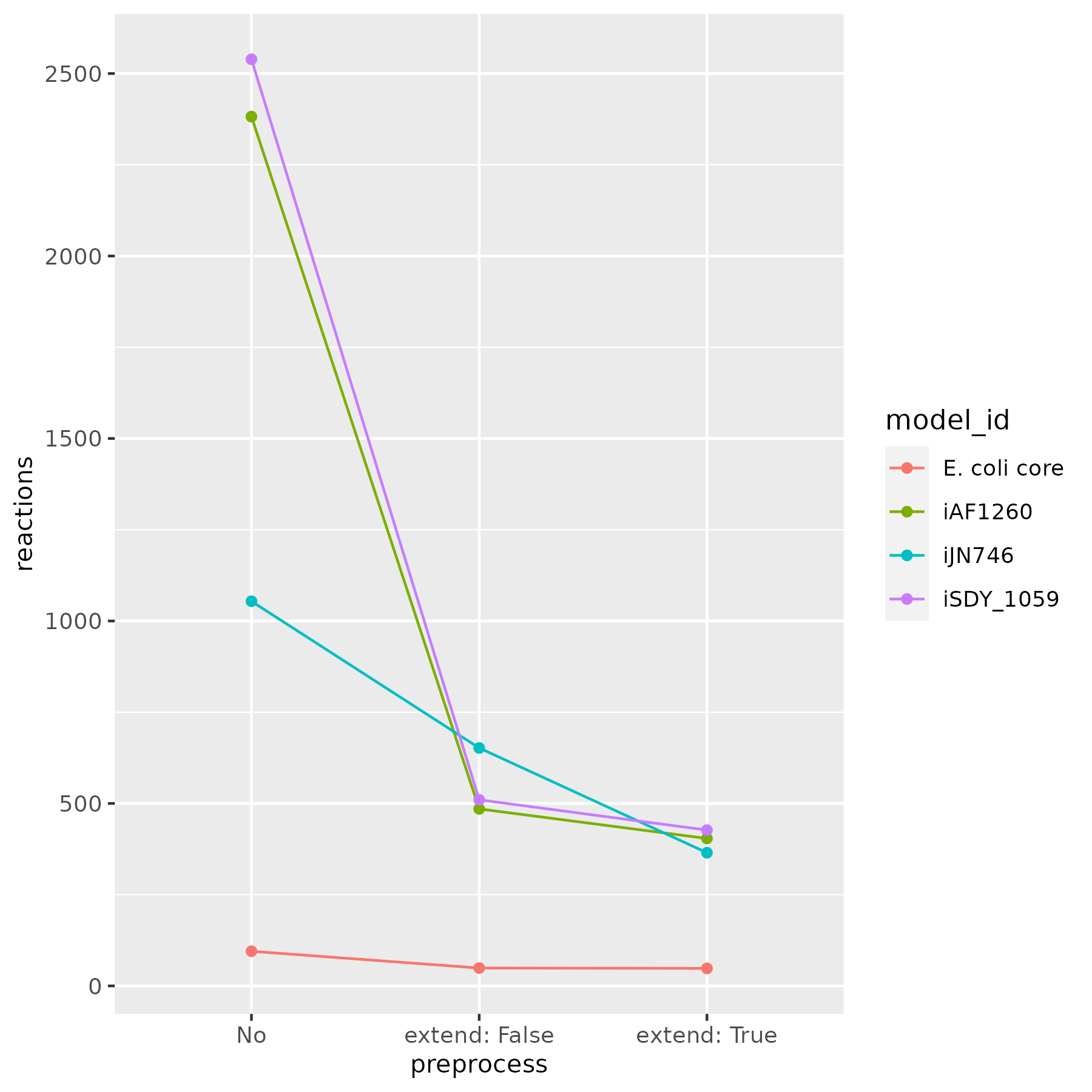
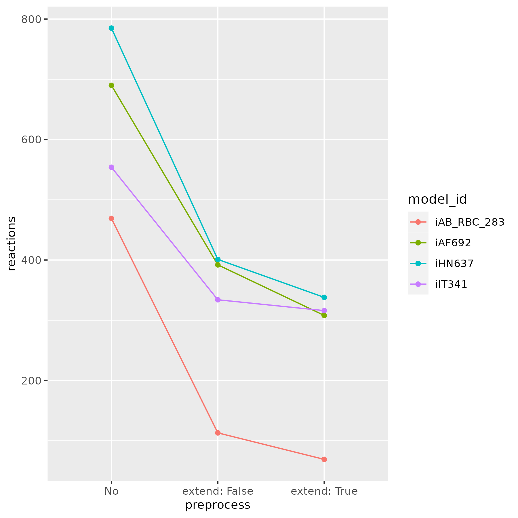
This process significantly reduces model complexity. In some cases, it yields core models, which are useful for examining essential metabolic pathways.
Identification of correlated reactions
- Reactions in biochemical pathways can be positively correlated, negatively correlated, or uncorrelated.
- Positive correlation means that if reaction A is active, then reaction B is also active and vice versa.
- Negative correlation means that if reaction A is active, then reaction B is inactive and vice versa.
- Zero correlation means that the status of reaction A is independent of the status of reaction B and vice versa.
Users can sample the flux space of a selected metabolic model using dingo’s PolytopeSampler class. Then, the correlated_reactions function can help them identify possible correlations in pairs of reactions. This function generates a correlation matrix based on the pearson correlation coefficient of pairwise reactions fluxes.
Users can apply cutoff values to filter the matrix, replacing all values that do not meet the threshold with 0. For instance, if a pearson cutoff is set to 0.80, all correlation values below this are replaced with 0. However, pearson is not the only available correlation metric.
Users can also filter correlated reactions using copulas. Copulas allow you to examine how two random variables (in this case, reaction fluxes) are related. You can read more about them here. Below is an example plot of a copula showing the relationship between two random variables:

Copulas are a useful statistical tool for validating significant correlations. However, manually inspecting copula plots can introduce user bias and be time-consuming given the number of paired reactions. An alternative to manual curation is using a metric called the “indicator,” which sums the probability values across each copula’s diagonal and divides them. The value of the indicator, whether positive or negative, helps validate or reject a possible correlation. Users can set an indicator cutoff that functions similarly to the pearson cutoff.
The following code shows how you can sample steady states of a metabolic network:
dingo_model = MetabolicNetwork.from_json("ext_data/e_coli_core.json")

sampler = PolytopeSampler(dingo_model)
steady_states = sampler.generate_steady_states()
And here you can see how to use the steady states to identify correlated reactions with the correlated_reactions function:
corr_matrix, indicator_dict = correlated_reactions(
                              # the reactions steady states
                              steady_states,
                              # cutoff to remove correlation below this pearson value
                              pearson_cutoff = 0.99,
                              # cutoff to remove correlations below this indicator value
                              indicator_cutoff = 2,
                              # number of cells to compute the copula
                              cells = 10,
                              # value that defines the width of the copula’s diagonal
                              cop_coeff = 0.3,
                              # boolean variable that when True, keeps only the lower triangular matrix
                              lower_triangle = False)
Except from the correlation matrix (corr_matrix), a dictionary object (indicator_dict) is also returned from this function. This dictionary contains all the pearson and indicator values for each set of reactions.
In addition to calculating correlations, a plot_corr_matrix function is available for visualizing the correlation matrix as a heatmap. This visualization helps users easily identify significant correlations.
plot_corr_matrix(
                 # the correlation matrix
                 corr_matrix,
                 # list containing reactions’ names
                 reactions,
                 # parameter that defines image saving format
                 format = "svg")
Here’s an example of a heatmap created from a symmetrical correlation matrix without cutoffs:
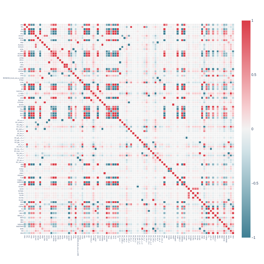
Each position in the heatmap represents the pearson correlation value between a set of reactions, with different rows and columns corresponding to different reactions. The color code indicates pearson correlation values on a scale from -1 to +1. Values near +1 (strong positive correlation) are shown in red, values near 0 in white, and values near -1 (strong negative correlation) in blue.
Dingo utilizes the plotly package for heatmap visualization, allowing you to easily find each correlation value by hovering over a specific position when the heatmap is loaded in a tab.
Keep in mind that larger models may produce heatmaps where reactions names will not be visible. You don’t have to zoom in the heatmap to identify the desired pearson values. The indicator_dict object contains all the information you need to identify correlations of interest.
We can now examine the previous heatmap and focus on correlations from reactions that belong to the glycolytic and pentose pathways to get some insights. You can visit ESCHER [7] and load the core metabolism map of E. coli to examine the reactions topology.
We observe strong pairwise correlations among all reactions in the pentose phosphate pathway (G6PDH2R, PGL, GND, RPE, RPI, TKT1, TALA, TKT2). However, for the glycolytic pathway (PGI, PFK, FBA, TPI, GAPD, PGK, PGM, ENO, PYK), two reactions, PFK and PYK, show decreased correlation with the others. Their corresponding correlation values are 0.81 and 0.30.
From the literature, it is known that PFK and PYK are catalyzed by enzymes that regulate glycolysis. These enzymes do not contribute to gluconeogenesis (the reverse pathway of glycolysis) because their reactions are unidirectional. When gluconeogenesis occurs, these enzymes have little or no activity, while other reactions function in reverse. This explains their lower correlation compared to other glycolytic reactions.
The gluconeogenic reactions that convert the products of PFK and PYK back into their substrates are FBP and PPS, respectively. These reactions may become active when there is an excess of D-fructose-1,6-bisphosphate or pyruvate, and the model must reduce their concentrations to achieve a steady-state condition.
This example shows how examining the correlation matrix can help researchers study metabolic pathways. However, this process can be challenging in genome-scale models due to the large number of reactions and pathways. Clustering and graph analysis can help automate this process.
Clustering of the correlation matrix
- Clustering based on a dissimilarity matrix reveals groups of reactions with similar correlation values across the matrix.
- Reactions within the same cluster may contribute to the same pathways.
The cluster_corr_reactions function hierarchically clusters the correlation matrix, and the plot_dendrogram function plots the resulting dendrogram.
Code that illustrates how to use the cluster_corr_reactions function:
dissimilarity_matrix, labels, clusters = cluster_corr_reactions(
                                         # the correlation matrix
                                         corr_matrix,
                                         # list containing reactions’ names
                                         reactions,
                                         # defines the type of clustering linkage (options: single, average, complete, ward)
                                         linkage = "ward",
                                         # defines a threshold to cut the dendrogram at a specific height
                                         t = 10.0,
                                         # A boolean variable; if True, the dissimilarity matrix is calculated by subtracting absolute values from 1
                                         correction = True)
In addition to the dissimilarity_matrix that is calculated by subtracting each pearson value from 1, two other objects are returned. The labels object is a list object, containing the index labels of the reactions that correspond to a specific cluster. The clusters object is a nested list containing sublists of reactions within the same cluster.
Code that illustrates how to use the plot_dendrogram function:
plot_dendrogram(# the dissimilarity matrix
                dissimilarity_matrix,
                # list with reactions names
                reactions,
                # variable that specifies whether reaction names will appear on the x-axis
                plot_labels = True,
                # threshold to cut the dendrogram
                t = 10.0,
                # variable that defines the linkage type for clustering
                linkage = "ward")
Here is an example of a dendrogram created from a correlation matrix with a pearson cutoff of 0.9999:
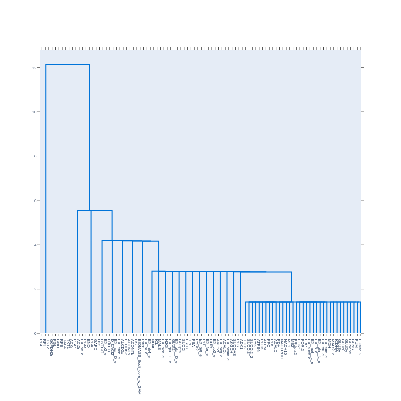
The leaves of the dendrogram represent individual reactions. We observe several well-separated, distinct clusters of reactions, indicating that within each cluster, there are groups of reactions with similar flux distributions, while reactions outside the cluster exhibit significant differences. These distinct clusters may contain reactions that contribute to the same pathways.
Some clusters contain reactions from the glycolytic and pentose phosphate pathways, as discussed earlier. Additionally, there are clusters with reactions from the citric acid cycle and other lesser-known pathways.
In the cluster representing the pentose phosphate pathway, we notice that PGI, a glycolytic reaction, is included. This is likely because it shares a common metabolite (D-glucose-6-phosphate) with G6PDH2r, the first reaction in the pentose phosphate pathway.
However, applying a stricter pearson cutoff (e.g., 0.99999) removes PGI from this cluster, leaving only the reactions of the pentose phosphate pathway.
This is an early but promising indication that clustering the correlation matrix can reveal groups of reactions that contribute to the same pathways.
In the future, other clustering methods such as k-means, HDBSCAN, and biclustering at the sample level will be explored to identify more specific clusters. Let me briefly explain: Some pathways have distinct phases, each serving a unique role in metabolism. Both glycolysis and the pentose phosphate pathways can be divided into two phases.
For example, the pentose phosphate pathway has an oxidative and a non-oxidative phase. Reactions such as G6PDH2R, PGL, and GND belong to the oxidative phase, which produces NADPH. Hierarchical clustering may not distinguish these phases, but using alternative methods not solely based on the correlation matrix could reveal two distinct clusters representing the two phases.
Graphs from the correlation matrix
- Creating graphs can reveal networks of correlated reactions, which may correspond to metabolic pathways.
- These graphs are generated from the correlation matrix, where reactions are represented as nodes and correlation coefficients as edges.
The graph_corr_matrix function generates graphs from the correlation matrix, and the plot_graph function plots these graphs.
Code that illustrates how to use these functions:
graphs, layouts = graph_corr_matrix(# the correlation matrix
                                    corr_matrix,
                                    # list with reactions names
                                    reactions,
                                    # boolean value; if True, transforms the correlation matrix values into absolute values
                                    correction = True,
                                    # nested list containing sublists of reactions within the same cluster, created by the `cluster_corr_reactions` function.
                                    clusters = clusters)

plot_graph(
           # graph object returned by the graph_corr_matrix function
           graph,
           # layout corresponding to the given graph object
           layout)
Here’s an example of a graph created from a correlation matrix without cutoffs:
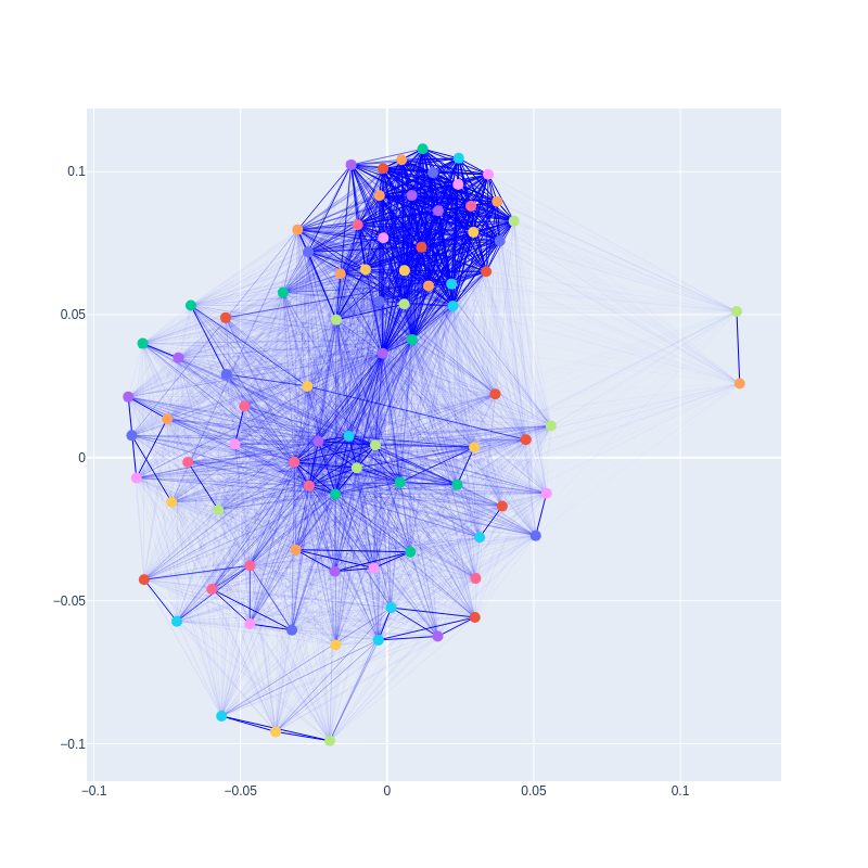
The width of each edge represents the correlation strength, scaled from 0 to 1. In addition to the initial graph, users can create and plot subgraphs that represent reaction subnetworks. These subnetworks can serve as supplementary information to clustering results, allowing researchers to identify similarities and differences between the two methods and adjust the structure of desired clusters accordingly.
However, the insights gained from graphs extend beyond pathway prediction. The more connected a node (reaction) is, the more essential its role likely is in metabolism. Conversely, nodes with fewer connections may represent reactions that can be removed without significantly affecting the system.
A potential example of an essential node is the one corresponding to the NADH16 reaction. In addition to reactions that are topologically close to NADH16, this node is also linked to reactions from the glycolytic pathway, even though they are not directly connected in the topology. NADH16 represents the enzyme NADH dehydrogenase, which produces the cofactor NAD.
NAD is the oxidized form of NADH, with NADH being the reduced form. Catabolic pathways, like glycolysis, consume NAD and generate NADH. This creates a need for NAD to be regenerated to allow glycolysis and other catabolic processes to continue. Therefore, NADH dehydrogenase plays a critical role in the glycolytic pathway, even though it may not appear to be directly connected in the topology of the E. coli core model.
In contrast, two nodes with strong connections between each other but weak connections with the rest are those corresponding to FRD7 and SUCDi. These reactions form a loop in the topology, with the products of one serve as the substrates for the other. The activity of each reaction depends on the other, with minimal influence from the remaining reactions.
Conclusion
Flux sampling offers significant statistical value, enhancing research in metabolic models. In this blog, we explored the pre- and post-sampling features integrated into the dingo package. From model reduction to pathway prediction, these features are designed to assist researchers in studying fundamental aspects of metabolic function.
References
-
[1] Jonnalagadda, S., Balaji Balagurunathan and Srinivasan, R. (2011). Graph theory augmented math programming approach to identify minimal reaction sets in metabolic networks. Computers & Chemical Engineering, 35(11), pp.2366–2377. doi:https://doi.org/10.1016/j.compchemeng.2011.05.006.
-
[2] Erdrich, P., Steuer, R. and Steffen Klamt (2015). An algorithm for the reduction of genome-scale metabolic network models to meaningful core models. BMC Systems Biology, 9(1). doi:https://doi.org/10.1186/s12918-015-0191-x.
-
[3] Apostolos Chalkis, Vissarion Fisikopoulos, Tsigaridas, E. and Haris Zafeiropoulos (2024). dingo: a Python package for metabolic flux sampling. Bioinformatics Advances, 4(1). doi:https://doi.org/10.1093/bioadv/vbae037.
-
[4] Meric Ataman, Hernandez, D.F., Georgios Fengos and Vassily Hatzimanikatis (2017). redGEM: Systematic reduction and analysis of genome-scale metabolic reconstructions for development of consistent core metabolic models. PLoS Computational Biology, 13(7), pp.e1005444–e1005444. doi:https://doi.org/10.1371/journal.pcbi.1005444.
-
[5] Lewis NE, Hixson KK, Conrad TM, et al. Omic data from evolved E. coli are consistent with computed optimal growth from genome‐scale models. Molecular Systems Biology. 2010;6(1). doi:https://doi.org/10.1038/msb.2010.47
-
[6] King ZA, Lu J, Dräger A, et al. BiGG Models: A platform for integrating, standardizing and sharing genome-scale models. Nucleic Acids Research. 2015;44(D1):D515-D522. doi:https://doi.org/10.1093/nar/gkv1049
-
[7] King ZA, Dräger A, Ebrahim A, Sonnenschein N, Lewis NE, Palsson BO. Escher: A Web Application for Building, Sharing, and Embedding Data-Rich Visualizations of Biological Pathways. Gardner PP, ed. PLOS Computational Biology. 2015;11(8):e1004321. doi:https://doi.org/10.1371/journal.pcbi.1004321